In order to get the chart to show the information you want, you may need to adjust the Dates, Group By setting and/or Filters and/or Display Settings.
It's easiest if you simply start at the top of the chart on the black bar:
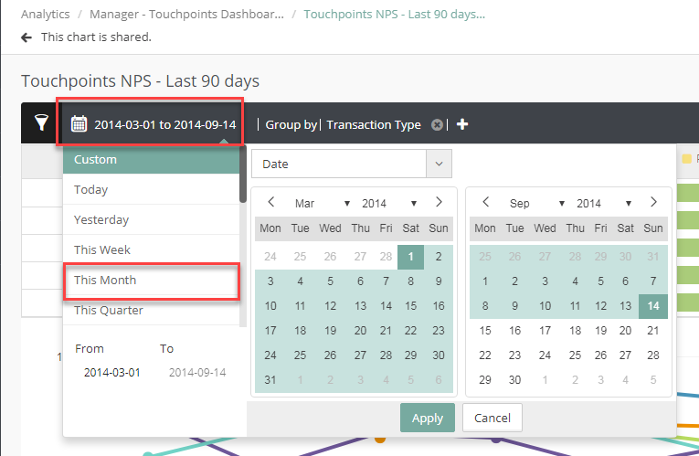
1. First determine what Dates for which you want to see data. If this is a report you will check regularly or if you will be sharing with someone you might want to select a rolling date such as 'Last Month', 'Last Quarter' or 'Last 30 Days' instead of a 'Custom Date'. It depends on how you will use the chart.
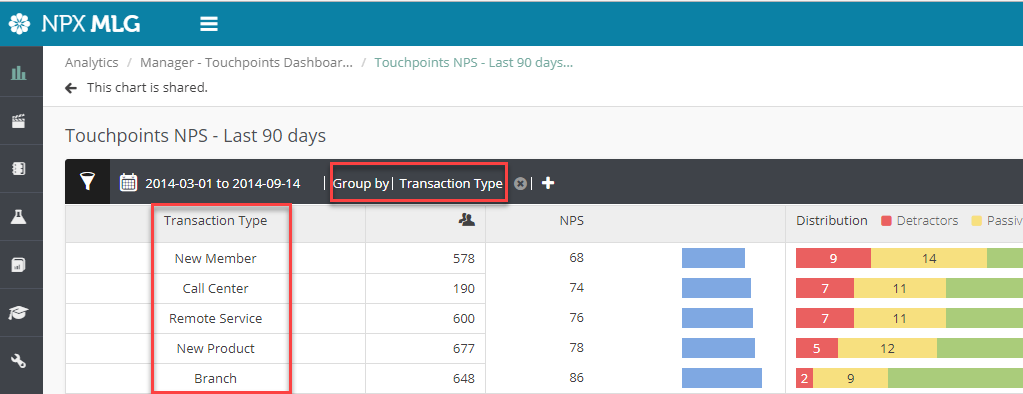
2. Next you need to decide if you want the information results grouped by certain data (such as Transaction Type or Agent), or if you want overall results only.
If you want the results grouped then you need to set the Group By filter to the right of the date. (See first screenshot below)
If you want the results grouped then you need to set the Group By filter to the right of the date. (See first screenshot below)
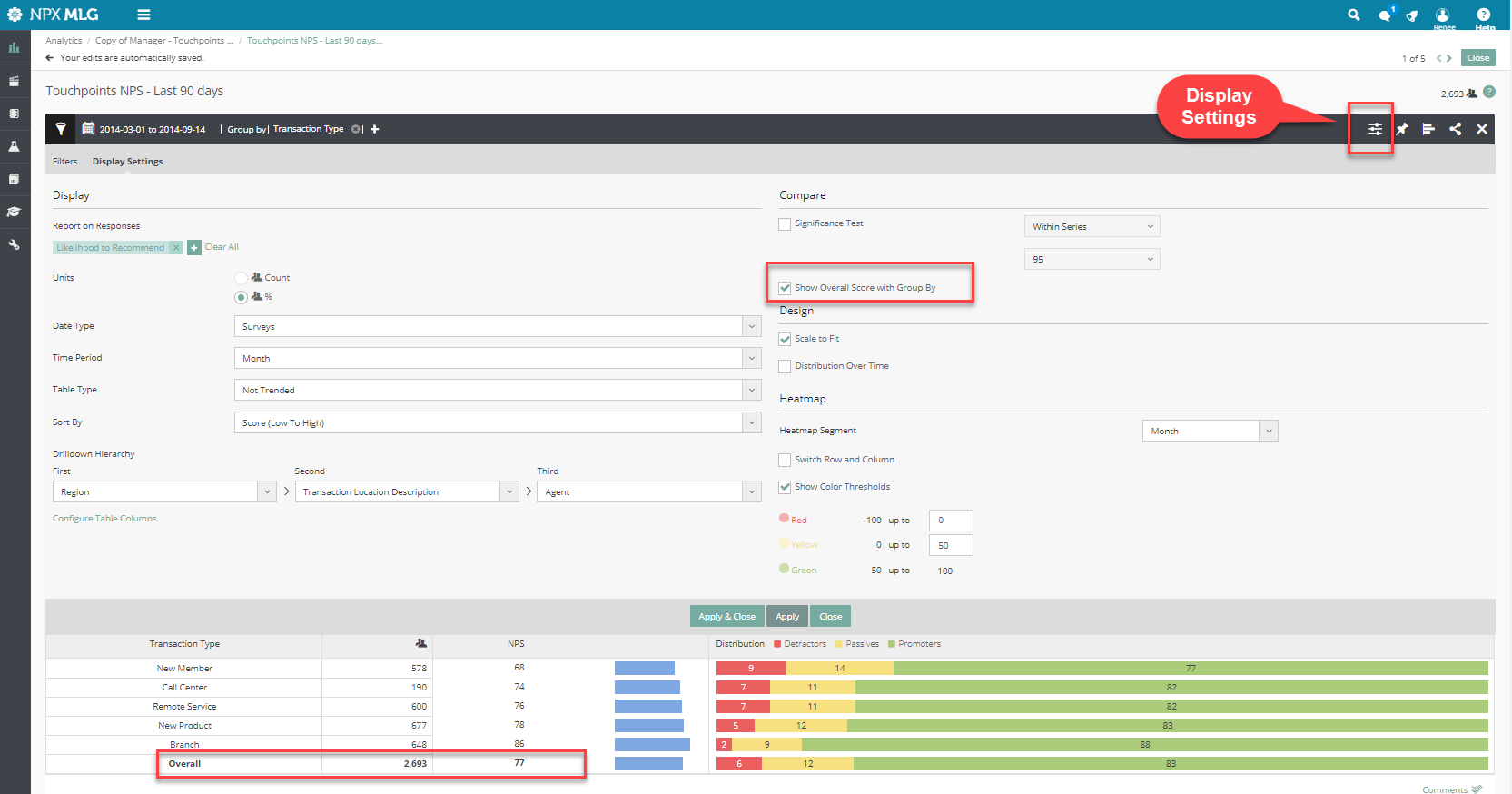
You can still get an overall score even with the information grouped by checking the Show Overall Score with Group By box in Display Settings (See second screenshot below).
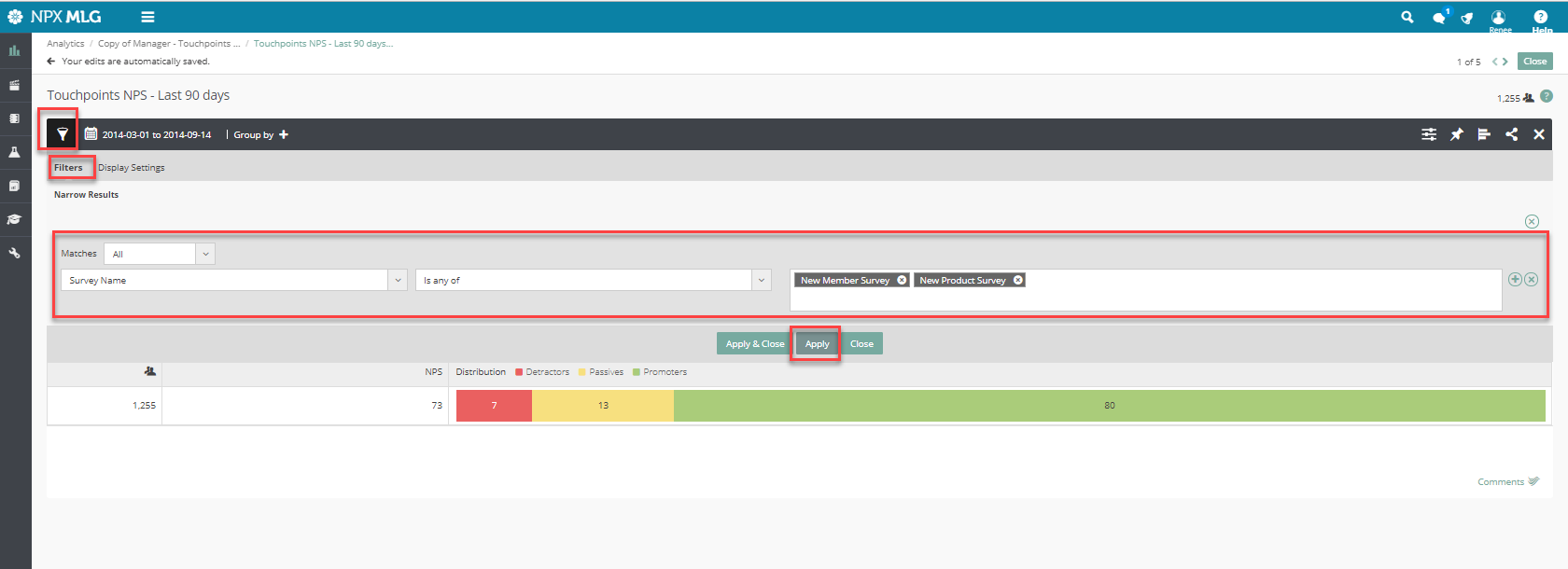
3. Next you want to filter and customize each chart. Open the Filter by clicking the funnel icon to the left of the date.
4. Pick the field/s that you want to use to limit the data you will see in your report.
For example, if you want to report on responses for just the New Member and New Product Surveys you would select this filter as shown below.
The more filter levels you add the more you narrow down your results. Click the '+' sign at the end of a filter to add another filter level, then click the '+' sign below this in the middle of the page to add and/or filter options as shown below.
You can add/remove filters and play around with them until you get the data you need.
You can add/remove filters and play around with them until you get the data you need.

Comments
0 comments
Please sign in to leave a comment.